Tuesday, May 5, 2009

only in iarc..

...will you walk into the bathroom and find people drawing.


Wednesday, April 15, 2009

Go With The Flow!

Firstly, hello to all the students and teachers over there! Ben and Fi here, from Ben the Illustrator and Wish You Were Here! Thanks for giving us the opportunity to guest post on your blog, it's always a pleasure to work with universities, discuss techniques and hopefully we can share a few nuggets of wisdom with you!

So, we're going to focus on water here. We're really inspired by water ourselves, we live near the beach and are surrounded by lakes and streams, we observe it, we enjoy it and we re-create it a lot in our illustration and design work. Water can add a lot of atmosphere to an illustration, it can be soothing and calming, epic and exciting, clean and refreshing, it is also crucial to it's surroundings, whether it's a small woodland stream, an epic coastline or a feature in a modern piece of architecture. Since water does come in different forms, many of which you might have to depict in your architectural drawings, it is a good idea to think about different ways of depicting it, being able to simply show if it's still or flowing, deep or shallow, and how it sits in it's surroundings.

Bens going to go it alone for a while here now to indulge himself in some good drawing talk!

First up, and the key thing that helped me figure out the best way to draw water... look at water. Spend some time looking at photos or videos of water, or better still see it for yourself, rivers, fountains, oceans, if you can, just stand and look at it. Crucially, look at the shapes it makes, and look at the shapes created within the water, so look at the actual shape of a wave (ignore the predictable way a child might draw a wave) or look at how water actually flows in a river, especially the way it flows over rocks. If you can break an area of water into separate shapes, or even patterns, then you're heading in the right direction. Water is usually made up of the same shapes over and over again, so feel free to re-use your shapes, whether you're drawing in pencil or doing a vector illustration on your computers.

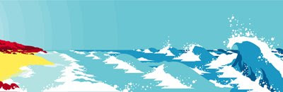
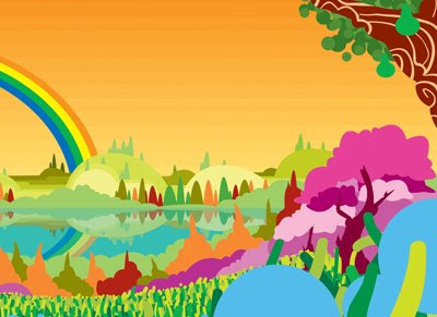
The illustration below I did a few years ago now, but it was one of the first times I was satisfied that what I was illustrating actually looked like water, the key to it was the shapes of the waves. I had spent some time obsessively studying wave forms for real, and then breaking them into basic shapes, which I then adapted to my own style of drawing and the kind of shapes I use in my illustration work.


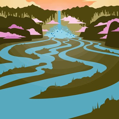
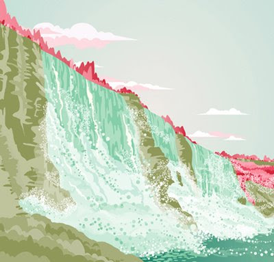
Following on from the shapes within a body of water, there is also the shape of the body of water itself, especially important for still water, which may not have much texture to it. If the water is natural, then the shapes it takes will also be natural, so you'll rarely find a straight line, but more so natural curves or rough edges. A drawn body of water doesn't always have to have a frilly edge like we think it should, it can have a perfectly smooth edge, and people will still know what it is. In the illustration below, you can see all the streams of water flowing towards you from the waterfall, and you know exactly what they are, yet all they are is smooth-edged, snake-like shapes.

Once you're getting somewhere with the basic shapes, start thinking about water as three different layers... firstly there is the depthy layer under the water, do you need to show anything under there? Then there is the surface itself, which can be either transparent, looking through to the deep, or reflective, mirroring what is around the water, the final layer is whatever is on top of the surface, foam, spray, bubbles etc.

For the deep layer, you might want to show fish, plants or anything structural, but understand that it wouldn't be perfectly clear, to achieve this it could be blurred or of limited colours, or your surface layer could be a semi-transparent tint of a colour, see the first illustration below.

The surface can either be textured if the water is flowing or flat if it's still. If it's still, it will often reflect at least a little, whether you're drawing this on paper or creating it on your computer, the simplest way to achieve this is to copy what you have above the surface, upside-down on top of the surface, often slightly squashed down, see the second illustration below.

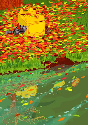
For the top layer, any bubbles, foam, spray etc, you are again best off looking at what basic shapes there are, with water I find that the predominant shape is a circle, simple as that, but what gives the right effect is the amount of circles and how intensely they are gathered together. So in the first illustration below I have added small bunches of white and blue circles to depict the clean little sprays coming off this wave, in the second illustration there are millions of circles all gathered together (of different transparency levels) to make a huge cloud of spray at the foot of the waterfall. These two illustrations are also good examples of the shapes I see in the texture of water, the different tones of blue in the wave in the first illustration, there's only three tones of blue there, but it seems to show a real depth and weight to the water in the wave.

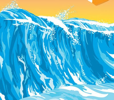
Finally, after shapes, textures and all the 'parts' that make up a body of water... colour. We all know that water is usually known as blue, but if you get the shapes right, you can make it any colour, it can really set a mood, it can be green, it can be any blue from cyan to turquoise, it can be pink, red or orange under the right natural lighting. Some of the illustrations I have shows here use the same theory on colour... use three or four different tones of the same blue, from a light through to a dark, deep water is dark, light shining off water is light, sheets of water will have a mixture of tones in them, just break these tones up into shapes or patterns and spread them around!

I think that's plenty enough water talk from over here, hope we haven't bored you or filled up your blog with our waffling! Good luck with your drawings, feel free to email if you've any questions! We'd love to see what you're all up to. Before we go, we have to admit something... we are incredibly jealous that you've just visited Fallingwater! We are huge fans of modern architecture ourselves and a visit to Fallingwater would be part of an absolute dream holiday for us both!

Keep creating

Ben & Fi!

Tuesday, April 14, 2009

working hard ...

we know you guys have a lot on your plate right now, but you can do it! heres a few photos to show your friends when you tell them, "no, i can't hang out tonight..." !
just a few more weeks left, hang in there!
love, your t.a.'s


Thursday, April 9, 2009

another approach


Check out Leah Rowland's latest blog post for more composite drawing inspiration....

Tuesday, April 7, 2009

composition inspiration

Below are examples of composite images found in Mike Lin's Drawing and Designing with Confidence: A Step-By-Step Guide.
Jay Kabriel, watercolor on 18" x 24" watercolor paper

Jay Kabriel, watercolor on 24" x 36" watercolor board


Thursday, April 2, 2009

traveling essentials

We leave tomorrow for Monticello and Fallingwater!

When last year's 1st year studio traveled to Washington I created the following list of visual reminders. I think it works pretty well for this trip too.
be prepared 1be prepared 2
No need for note cards this time around...your trusty opus will do just fine!

Wednesday, March 25, 2009

rendering suggestions

here are just a few more references to inspire you as you begin to render your perspectives.
the following images are from the book Color Drawing by Michael E. Doyle

in this image they are using a paint brush to make white highlights, a paint pen would do this as well

shading a shadows are what give your rendering depth, use your grays as well as graphite

these are showing how to do your renderings in steps and use a gradient to create reflective surfaces


this is showing the importance of colored pencils

Drawing and Designing with Confidence by Mike Lin is also a great book to look at.

helpful pointers :

• test colors on the same kind of paper that you will be using.
• do lighter colors first, you can go darker, but not that much lighter.
• (going over lighter colors with a gray is a good way to gradually darken colors.)
• you don't have to use markers alone- try graphite underneath/on top, and color pencils on top (going over colored pencil with markers will ruin them, the wax clogs the tip.)
• a white paint pen can also be used to help make highlights
• use a slip sheet. the marker may bleed through, so you will want a barrier to protect the paper or surface underneath your drawings.
• save old markers. they can be used for shading as a ‘dry brush’ appearance in your drawings.
• marker paper has two sides. make sure you are rendering on the correct side for a smooth appearance.
• store markers horizontally, especially with prismas (prevents drying out of the two tips).

• prismacolor-
• pros: dry marker. allows for a more detailed line
• triple tip allows surface variety
• cons: difficulty maintaining a ‘wet edge.’ wait too long, and the added color will cause bleed lines and overlapping

• chartpak-
• pros: wet marker. cover larger areas
cons: bleeding

Thursday, March 19, 2009

perspective therapy

here we have assembled a list of a few good product and furniture online retailers. in your next 112 assignment, you will be drawing and rendering a space you design. we hope these help!


Tuesday, March 17, 2009

plain english


Here's the link to the article Stoel mentioned in class yesterday. We encourage you to make direct connections to this text within your own articles.

here's to the process...

after a long spring break, it is time to set out in search of the threads that tie our stories together. here are your opus 8 prompts:

grammar : syntax

[re]visions
audience
character
transition
datum

Sunday, March 15, 2009

macro : micro...

hope everyone enjoyed a restful spring break....but now, it’s back to business, picking up where we left off with the MICRO : MACRO entries on the following blogs…elizabeth green, cara schwall, haley sudderth, brittany stiles, and rachel cash.

elizabeth
organized her post with an intro and summary to help frame the prompts, suggesting that MACRO represents ideas about the structure itself while MICRO represents “a more internal meaning.” with well-woven quotes from roth and blakemore, she brings us to the world of the renaissance, intimately connecting that time and place with, among other places, rome….casting both worlds in a “bread and circus” frame. nicely done!


cara characterizes architecture as “a COMPOSITION made of details,” taking care to link her studies in history with her studio work as well as her drawing classes. she theorizes about meanings for domes in the renaissance as symbols of unity, connecting back to their roman prototypes. in citing roth, cara wrote about the circle and square as “basic design modules…delineated by classical columns, arches, and entablatures derived from Roman sources (Roth 362),” an example of a useful citation that demonstrates her command roth as a resource available for the course. where’s blakemore?
cara's drawing to demonstrate assemblages coming together in the foust [?] building, linking drawing + history class.

haley brings work from drawing class, studio, and current as well as past weeks from history and theory class, making an IMPRESSION, defining that as both a “long lasting” and “remembered” moment. he blog post makes an IMPRESSION on the reader that she reminds us all that when we express ideas, we should strive for “a positive reaction and a sense of professionalism” and by “adding DETAIL to your drawings or a design” to enhance work. with a variety of illustration techniques, haley shows her growing skill and her demonstration of professionalism in her work.
haley's cathedral drawing reminds us that the impression left by these buildings is one of strong unities.


at the orange [nice color!] mustang, brittany subjects the reader through overly succinct and disconnected definitions for each of the prompts. she also misses the opportunity to summarize her thoughts about the week’s vocabulary and any connection outside history class. two roth citations do not suggest an understanding by brittany of reading for the course. she includes DETAILed drawings and DIAGRAMS.
brittany leads the way this week in demonstrating a variety of drawing techniques + diagrams,
quite useful for the precedent analysis project later in the semester.


and onto rachel, who guides the reader through a discussion of PORCH : COURT : HEARTH, stopping both in greece and rome to remind the reader of antecedents to the tripartite way of organizing gothic cathedrals. a brief summary could use more articulation to fully resonate with the writing in the remainder of the post. check out her drawing for IMPRESSION of a gothic cathedral interior….sweet!
another drawing of unity in gothic cathedrals, this one from rachel's hand.

Thursday, March 5, 2009

board layout exercise

These are examples of presentation layouts from projects I worked on as a student. Strive to achieve a similiar level of detail in your own scale thumbnails as it will help you tremendously when it comes time to assemble your boards. Click on the images to see them larger.
board layout sample 1
board layout sample 2
Test a variety of ideas before settling on a final board design. What layout tells your story best? What color boards make your drawings pop?

In addition, visit this link to see the presentation boards created by last year's class. They set a high bar and I expect no less from you.

-Suzanne

Wednesday, March 4, 2009

translations of YOUR translations

REFLECTION FROM THE RECENT PAST : you are not the first class to undertake the "portals" project in brown cardboard. notice how these images show clarity of thought, exploration of light, investigation of materials, acknowledgment of site.


we looked at your studio installation in brown cardboard and make the following observations from the history/theory perspective…
1. take better advantage of the site

2. utilize graphics to direct the viewer towards comprehension

3. unify parts (porch : court : hearth are parts of a SYSTEM)

4. details should support the composition on the macro and micro scales

5. explore the qualities of cardboard more completely
6. utilize lighting opportunities as a design tool
7. don’t be afraid of color

8. work carefully to diagram proximity, balance, rhythm

9. distill to an essence, build with precision, and communicate clearly

10. impress upon others your nuanced knowledge of history and your site


some specific notes for each installation…


cromlech of stonehenge :
sadly by the time we reviewed this project it had been removed.

ziggurat of ur-nammu : the pieces are not representative of the whole, as the ideas of symmetry, contrast, and positive/negative space are not fully realized within the overall structure installed. the suspended elements fail to synthesize with the extended fins in a way that represents both positive and negative space. graphically the information portrayed also does not hang together.

city of the gods :
a large amount of pattern making within both the structure and graphics that draws abstractly from the buildings, but the ‘whole’ lacks coherency in terms of the processional quality of the site. the graphics do not communicate clearly and succinctly the intensions of the designers.

the great wall of china : the composition of the doorway surround speaks of topographical change and a certain fluidity. in crossing the boundaries of the door frame above eye level the group missed an opportunity to melt the installation on its site, unlike the detail at floor level. beautifully rendered graphics lack clarity in linking to vocabulary – some too literal, some unclear.

pyramids of giza :
we see contrast in the use of materials as well as a surface exploration of positive and negative. these ideas should be explored more thoroughly and fully through out the installation. too many disparate parts throughout – where the pyramids at giza are clear and obvious in their intent, this group fails to capture that spirit.


queen hatshepsut : it is not clear how the curvilinear and cylindrical elements help express the cohesive design statement of the queen’s tomb. her’s is a singularity and OF the site this composition strays from acknowledging the site. while there is symmetry in the surround, certain details contradict the essence of the whole. and this contradiction can be seen within the graphics.

temple of amon : we appreciate the exploration of color for a polychromatic society, forms used within the design of the structure miss the expression of karnak as a collection of portals. the depth of the triangular pediment and the color blocks behind it bring a level of contrast but we have a hard time seeing how rhythm, boundaries, proximity and balance work within the composition.

lion's gate :
we appreciate the sited-ness of the installation, but do see a direct connection to the massive, solemn, compressing characteristics of Mycenae. the exploration of material echoes structure in tension and not in compression. internally the graphic blocks lack clarity in composition and execution.


palace, phylos :
playful character of this installation belies a building tradition at phylos that speaks of calm rationality. while color was explored in the graphics, the group missed the opportunity to address this in the larger whole. we appreciate the messy vitality and vibrancy of the approach but wonder about the wisdom of the geometries in its component parts.


propylaia :
the perpendicular fins shape an experience that has depth and surface variety. we find this to be parallel to the experience of the propylaia. we appreciate that the group explored multiple views in their work. the graphics lack clarity.


pantheon :
light spills in waves, cascading down this portal in sharp contrast to the singularly focused beam of light experienced in this building. anything but playful the light experience in the pantheon grounds our understanding of the building and the universe it shapes there. the light here scatters rather than coalesces. graphics do not link with the other design work.


baths of caracalla :
we applaud achieving compression with cardboard, but fail to understand the lack of exploration in surface material and quality so key to the construction of the bath. one graphic panel indicates striving for craft – but the group does not deliver on that pledge.
“old” saint peter’s : compositionally, the varying sized tubes draw our eye to the far end of the first floor corridor. on arrival we learn that this representation works against the very building assigned. without explanation in the graphics, the viewers are left to draw their own conclusions about connections. as a symbol of permanence and importance, st. peter’s basilica gets lost here.

REMEMBER, the lessons you learn from this “found in translation and then” exercise should DEFINITELY be applied to your precedent analysis at the end of the semester. keep this post handy!

p week

the opus prompts for week 7 will be due on wednesday, march 18.

periphery
portfolio
process
perspective
professional

Sunday, March 1, 2009

opus : week five observations

ethan aiken draws together PRESENCE, PRECEDENT and MOMENTS in reminding us all that buildings set scenes to draw people in…these scenes are made from examining past architecture and shaping particular aspects and characteristics (MOMENTS) for the building at hand. in drawing to the larger context, ethan suggests that where buildings in the ancient world were more singular in purpose, key DUALITIES exist within roman buildings, but all represent order arising from chaos, as “we are moving towards the buildings that we know today.”
david harrill's drawing of san vitale in describing duality.

david harrill
admits that he believes that the words this week don’t relate as well as past weeks. yet in his post, he shows us all of the connections from history to studio, to drawing class, and to drafting class….there must be something to all these connections made that pulls the week together.


micah martin's contour drawing for duality.

micah martin
offers the big comparison of the week: “i realize now that the architecture in rome reveals a society that much reflects our own society here in America,” drawing on the cues from the baths exercise of mid-week. micah’s well composed and grounded use of roth and blakemore sources as an internal rhythm for his post. he also makes an astute reflection on civility in roman society noting that “the civic structures in Rome, especially those of the baths, served as a framework for the society” by “giving work to those who built it,” and through the creation of “narrative in civility” suggested by the variety of users to these structures.

philip snider's studio project.

phillip snider provides examples of his own work to demonstrate both DUALITY and MOMENT, as shown here….sadly, these great examples don’t continue through the entire post. erica anderson’s post, similarly, does not bring to the fore the salient points of the week to talk about VOICES in architecture and design, utilizing the prompts MOMENTS, PRESENCE, PRECEDENT, DUALITIES, and METRICS. all of these prompts lead toward stories for each building or place, a point to push further in the blog entries.

TO THE CLASS...continue to adhere to the tenets and requirements of the rubric for posting. citations are important, as is connective, synthetic writing throughout each post.

Wednesday, February 25, 2009

diagrams


these diagrams are from mike w. lin's drawing and designing with confidence(1993, wiley).

Monday, February 23, 2009

parts : wholes : and everything in between

up for week 4…
haley preston, riley smith, aubrey loyd, neal mickey, charese allen….


haley preston starts our odyssey (get it? it’s about greece) through the week 4 material independently defining each of the vocabulary words, with her greatest success in bringing pat’s chair into the description of ARCHETYPE : PROTOTYPE : HYBRID. her closing summary does little to move forward the discourse of parts to the whole, though her idea about three scales…details, parts, and wholes….makes sense in light of our study of the built environment and the artifacts within it. her careful annotation of images and inclusion of citations both deserve mention.

image courtesy of riley smith

riley smith attempts a more synthetic view, characterizing masculine and feminine qualities in the greek ORDERS in the first part of her entry. she turns on the gas with stellar images from her own trip to rome, bringing to bear her direct experience of those buildings in helping the reader to understand HIERARCHY. good words about greek and roman architecture as SOURCE. nice photos, riley!

up next, aubrey loyd achieves synthesis, particularly when writing about SOURCE, drawn from the greek and roman worlds, and bringing to bear on her own experience in drawing class. linking SOURCE and ARCHETYPE : PROTOTYPE : HYBRID, aubrey reminds us that the great traditions of design rest on the traditions of the past. in this way, we carry sources on our shoulders as we continue forward in our designs. remember the nautilus shell from the first week of class?


image courtesy of neal mickey


neal mickey weaves a narrative that demonstrates a fine command of the various vocabulary for the week, summarizing in diagram form, his “big bang theory.” the bang comes, not so much in the final diagram but in neal’s wise use of images throughout his post. in this way, he creates a HIERARCHY for the post, with the visual images shaping and explaining his argument, even without a read through the text. but don’t let that stop you from his constructed and convincing story.

charese allen's thumbail sketch in the euc.

charese allen is all about collection and speculation and we see in her blog post this manifest in her clever writing and her salient drawings and diagrams. reminding us that we all seek order, she then goes on to carefully explain how ancient civilizations embraced this and other concepts for their buildings and artifacts within them. through careful annotation and ample reference to the assigned readings, charese shows skills as a master weaver from many SOURCES across the first year curriculum. she distinguishes between out and out copying versus inspiration from the past. this is a smart view worth considering by all of her classmates.

in all, this week’s summary statements lean more toward a synthetic view. every author’s goal in the class should be to strive for seamlessness and for observations like charese’s connecting the unlikely juxtaposition of the egyptian hypostyle hall and the elliott university center. given that the goal of all this OPUS activity is for every student to more confidently speak AND write about architecture and design, charese and neal show insight and originality beyond the expected…a very good thing and much more interesting to read than simple definitions of vocabulary words.

wrapping up week 3

in defining SECTION, many of these students took the most basic understanding of section as a vertical slice through a building to have a look inside. remember that at different SCALES, section cuts yield significant information. for an artifact or a wall, a SECTION might explain how technically materials come together, detailing our understanding of the FIRMNESS of the structure proposed and the fitness of the design opportunity. for a building, a SECTION provides information for the reader of the drawing to understand architectural space and how the various elements within a room come together as an architectural UNITY. in a city, a SECTION might tell us how component neighborhoods and elements within the community begin to shape human experience on a grander SCALE than a single building. in considering this cross SECTION through life, we get a way to compare buildings and spaces…and to understand better some of the thinking by humans to shape the built world. by considering a LONGITUDINAL SECTION of a city, however, we come to understand the impact of time on the landscape and the buildings that populate it. this idea of TIME seems incredibly useful in the history course as we continue to take the LONG VIEW of all of the built world and the objects within it. as we continue to think about all of the various SCALES at which we might consider an object as mundane as, let’s say “pat’s chair,” we recognize the raw power of the designer to transform the world one building or object at a time, as the resonances that echo outward from each design opportunity have ripple effects to the neighbors in immediate CONTEXT but across and through time to the present. by removing the BOUNDARY from SECTION, we unleash a powerful way to understand and talk about the built environment.

PLEASE NOTE : unfortunately, ellie grigg and rebecca pryor did not post this week so they couldn’t add to this dialogue.

linkages from week 3

hailey granetz boldly steps forward in her synopsis to suggest that all of the words for this week can be linked if we only understand them each as a system, a way of looking at the world around, first by defining BOUNDARIES as a form of limitation for a project, then by considering the SCALE of the human experience that should happen within the parameters designed, then by thinking about how all of the parts defined come together in a UNIFIED whole, utilizing both VIGNETTES and SECTIONS as communication devices to tell others about designer intentions…..if only it were this easy…and linear a process. design is much more about all of those BOUNDARIES and SCALES remaining in flux until the right balance comes forward (with intense work, some significant consumption of caffeine, and some sheer luck) to a UNITY worthy of being brought into the world. if we are to consider design as the socially-responsive re-allocation of resources, it behooves us as designers to be sure that we remain open to the possibilities without quickly setting limits. we think that’s what happened at the ACROPOLIS where the designers continually manipulated SCALE and refined and refined and refined AGAIN the relationship between all of the buildings and spaces into the UNITY considered by many to be the great ARCHETYPE of all buildings emulated through the ages to our very own.

From Inspiration to Your Own.. Tips for Success!

Precedent
Here are a few examples from second years when they did this same project last year. This level of detail and attention to different styles is what we are expecting with this assignment. We also chose these due to the fact that they lack any color. It is imperative to know that color can't be used as a crutch; if your initial drawings are not well developed, the color will not improve them. Work on the basics before you move on to color because color can be rather tricky.

Ben Adams
Ben's drawings show depth through line weight as well as a good variety of different styles. His moves are bold, but they parallel his inspiration drawings. 

Kurt Huizenga
Kurt payed attention to his inspiration. He perceives the drawings on various scales, from the most detailed, to the composition itself. As a result, his drawings captured the essence of his inspiration. 

Lauren Thore
Lauren excelled in use of contrast. Her drawings stand out because of their distinct resemblance to her inspiration. Tip: if the inspiration has high contrast, be bold! Go equally as dark.

Anna Will: Inspiration & Drawings
A good drawing isn't always the traditional one. Anna used different media for the backdrop, creating a dynamic and interesting piece of work. 

More scale figures...
Images from Rendering with Pen and Ink by Robert W. Gill


Let this be a reminder that, from now on, scale figures should be incorporated into your drawings. They evoke an emotion that is difficult to manage without them. Just as line-weight or shading aid in creating depth and reality to your work, scale figures make your drawings come to life (no pun intended!) It is also important to make sure the types of scale figures you include in your drawings fit within your drawing's context, the reason we chose these pages filled with many different poses.
On another note, we would like you guys to explore the resource library as well as any other library. They are full of examples and techniques that can further help you develop your style, so check them out!

What You Should Take From This:
The point of this assignment isn't just to "make a drawing," but to get you to celebrate the different buildings and spaces your group will be presenting about. At the same time, exploring different styles of rendering will help you develop a greater sense of your own style for the future.

One final note.. Don't forget that the 2nd years did this same project last year, and we are always here to help. You can browse our blogs here, or just ask!

Wednesday, February 18, 2009

part deux of opus reviews : brian peck...


drawing courtesy of brian peck


...in writing of the elusive
UNITY, brian peck suggests that “including a design element that isn't seen or detracting from the design but accommodates comfort is just as important as the design element you can see,” reminding us that as designers and appreciators of design that we have to look for the hidden as well as the obvious messages intended and received, looking far beyond the surface of any designed artifact, space, building, or place. the UNITY, then comes in considering the totality, without BOUNDARY. we find this a very provocative idea…and one that students should consider more as we move through time and space in iar221.

Tuesday, February 17, 2009

Annotate Everything

Hey guys,
As we were checking the thumbnail posts, we found amazing drawings, with no annotations to accompany them. Yes, the drawing is the key element in the post, but there should be some form of writing as well. Verbal and visual go hand in hand when conveying your art. So please annotate every post from now on. It does not have to be formal; just something to further evoke the emotion in your drawings. 

patrick ruminates on opus three

as part of our regular weekly posts, we will select five students at random to feature for some evaluation on their opus project. we provide this feedback as a way to indicate to the whole class the patterns that we see in the opus project generally and some alternative ways to think about and write about design. remember, above all, that the opus project allows you the intellectual space to synthesize all that you are learning from the various classes into a seamless entry. the “summary” post is a good place to be sure we understand that you can link all the PARTS together into a well-considered WHOLE. without that summary, it’s very difficult for us to reasonably situate the other annotations within a sense of your growing understanding of design.

the opus three random selectees: chey shelton, brian peck, hailey granetz, ellie griggs, and rebecca pryor.

drawing courtesy of d. chey shelton


with chey shelton’s post, we discover his characterization of parts to the whole in as a UNITY in design… though he mentions entourage as an alternative way of providing vignettes, he does not make explicit the connection between vignettes (collections of objects to tell a story) to this idea of unity. in nailing the idea of SCALE and tying it to several civilizations we have studied thus far, we see that he has begun to understand that all buildings have some relationship to the humans inhabit them. whether they are used to “induce a feeling of unworthiness in commoners and an ego boost in aristocrats” or whether they act as “a veil to outsiders,” buildings and their components (porch, court, hearth) and the walls that inscribe them represent some of the most basic elements used by environmental designers to shape the world for human experience.

student spotlight : carlos smith


Thought you might enjoy an encore presentation of Pat building a stone wall. See more of Carlos' fun animations here.  Did you know he creates these mini-movies using his cell phone?

drawing on location

We spoke a little in class this morning about the difference between drawing from photographs and drawing from life.  To me, nothing beats working within the environment one is attempting to capture...soaking it all in...the smells, the sounds, the textures, the people, etc.   These are things you miss when drawing from photos.

Take a look at the work of Salvador Castio via his blog for great examples of drawing on location. In particular, pay attention to the way in which Salvador describes his process and environment. I think we can all benefit from the advice Salvador includes in the top left corner of this drawing : "Draw ceaselessly and do it with resolve; draw things your way and do it brilliantly."