Wednesday, March 25, 2009

rendering suggestions

here are just a few more references to inspire you as you begin to render your perspectives.
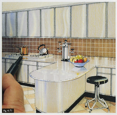
the following images are from the book Color Drawing by Michael E. Doyle

in this image they are using a paint brush to make white highlights, a paint pen would do this as well

shading a shadows are what give your rendering depth, use your grays as well as graphite

these are showing how to do your renderings in steps and use a gradient to create reflective surfaces


this is showing the importance of colored pencils

Drawing and Designing with Confidence by Mike Lin is also a great book to look at.

helpful pointers :

• test colors on the same kind of paper that you will be using.
• do lighter colors first, you can go darker, but not that much lighter.
• (going over lighter colors with a gray is a good way to gradually darken colors.)
• you don't have to use markers alone- try graphite underneath/on top, and color pencils on top (going over colored pencil with markers will ruin them, the wax clogs the tip.)
• a white paint pen can also be used to help make highlights
• use a slip sheet. the marker may bleed through, so you will want a barrier to protect the paper or surface underneath your drawings.
• save old markers. they can be used for shading as a ‘dry brush’ appearance in your drawings.
• marker paper has two sides. make sure you are rendering on the correct side for a smooth appearance.
• store markers horizontally, especially with prismas (prevents drying out of the two tips).

• prismacolor-
• pros: dry marker. allows for a more detailed line
• triple tip allows surface variety
• cons: difficulty maintaining a ‘wet edge.’ wait too long, and the added color will cause bleed lines and overlapping

• chartpak-
• pros: wet marker. cover larger areas
cons: bleeding

Thursday, March 19, 2009

perspective therapy

here we have assembled a list of a few good product and furniture online retailers. in your next 112 assignment, you will be drawing and rendering a space you design. we hope these help!


Tuesday, March 17, 2009

plain english


Here's the link to the article Stoel mentioned in class yesterday. We encourage you to make direct connections to this text within your own articles.

here's to the process...

after a long spring break, it is time to set out in search of the threads that tie our stories together. here are your opus 8 prompts:

grammar : syntax

[re]visions
audience
character
transition
datum

Sunday, March 15, 2009

macro : micro...

hope everyone enjoyed a restful spring break....but now, it’s back to business, picking up where we left off with the MICRO : MACRO entries on the following blogs…elizabeth green, cara schwall, haley sudderth, brittany stiles, and rachel cash.

elizabeth
organized her post with an intro and summary to help frame the prompts, suggesting that MACRO represents ideas about the structure itself while MICRO represents “a more internal meaning.” with well-woven quotes from roth and blakemore, she brings us to the world of the renaissance, intimately connecting that time and place with, among other places, rome….casting both worlds in a “bread and circus” frame. nicely done!


cara characterizes architecture as “a COMPOSITION made of details,” taking care to link her studies in history with her studio work as well as her drawing classes. she theorizes about meanings for domes in the renaissance as symbols of unity, connecting back to their roman prototypes. in citing roth, cara wrote about the circle and square as “basic design modules…delineated by classical columns, arches, and entablatures derived from Roman sources (Roth 362),” an example of a useful citation that demonstrates her command roth as a resource available for the course. where’s blakemore?
cara's drawing to demonstrate assemblages coming together in the foust [?] building, linking drawing + history class.

haley brings work from drawing class, studio, and current as well as past weeks from history and theory class, making an IMPRESSION, defining that as both a “long lasting” and “remembered” moment. he blog post makes an IMPRESSION on the reader that she reminds us all that when we express ideas, we should strive for “a positive reaction and a sense of professionalism” and by “adding DETAIL to your drawings or a design” to enhance work. with a variety of illustration techniques, haley shows her growing skill and her demonstration of professionalism in her work.
haley's cathedral drawing reminds us that the impression left by these buildings is one of strong unities.


at the orange [nice color!] mustang, brittany subjects the reader through overly succinct and disconnected definitions for each of the prompts. she also misses the opportunity to summarize her thoughts about the week’s vocabulary and any connection outside history class. two roth citations do not suggest an understanding by brittany of reading for the course. she includes DETAILed drawings and DIAGRAMS.
brittany leads the way this week in demonstrating a variety of drawing techniques + diagrams,
quite useful for the precedent analysis project later in the semester.


and onto rachel, who guides the reader through a discussion of PORCH : COURT : HEARTH, stopping both in greece and rome to remind the reader of antecedents to the tripartite way of organizing gothic cathedrals. a brief summary could use more articulation to fully resonate with the writing in the remainder of the post. check out her drawing for IMPRESSION of a gothic cathedral interior….sweet!
another drawing of unity in gothic cathedrals, this one from rachel's hand.

Thursday, March 5, 2009

board layout exercise

These are examples of presentation layouts from projects I worked on as a student. Strive to achieve a similiar level of detail in your own scale thumbnails as it will help you tremendously when it comes time to assemble your boards. Click on the images to see them larger.
board layout sample 1
board layout sample 2
Test a variety of ideas before settling on a final board design. What layout tells your story best? What color boards make your drawings pop?

In addition, visit this link to see the presentation boards created by last year's class. They set a high bar and I expect no less from you.

-Suzanne

Wednesday, March 4, 2009

translations of YOUR translations

REFLECTION FROM THE RECENT PAST : you are not the first class to undertake the "portals" project in brown cardboard. notice how these images show clarity of thought, exploration of light, investigation of materials, acknowledgment of site.


we looked at your studio installation in brown cardboard and make the following observations from the history/theory perspective…
1. take better advantage of the site

2. utilize graphics to direct the viewer towards comprehension

3. unify parts (porch : court : hearth are parts of a SYSTEM)

4. details should support the composition on the macro and micro scales

5. explore the qualities of cardboard more completely
6. utilize lighting opportunities as a design tool
7. don’t be afraid of color

8. work carefully to diagram proximity, balance, rhythm

9. distill to an essence, build with precision, and communicate clearly

10. impress upon others your nuanced knowledge of history and your site


some specific notes for each installation…


cromlech of stonehenge :
sadly by the time we reviewed this project it had been removed.

ziggurat of ur-nammu : the pieces are not representative of the whole, as the ideas of symmetry, contrast, and positive/negative space are not fully realized within the overall structure installed. the suspended elements fail to synthesize with the extended fins in a way that represents both positive and negative space. graphically the information portrayed also does not hang together.

city of the gods :
a large amount of pattern making within both the structure and graphics that draws abstractly from the buildings, but the ‘whole’ lacks coherency in terms of the processional quality of the site. the graphics do not communicate clearly and succinctly the intensions of the designers.

the great wall of china : the composition of the doorway surround speaks of topographical change and a certain fluidity. in crossing the boundaries of the door frame above eye level the group missed an opportunity to melt the installation on its site, unlike the detail at floor level. beautifully rendered graphics lack clarity in linking to vocabulary – some too literal, some unclear.

pyramids of giza :
we see contrast in the use of materials as well as a surface exploration of positive and negative. these ideas should be explored more thoroughly and fully through out the installation. too many disparate parts throughout – where the pyramids at giza are clear and obvious in their intent, this group fails to capture that spirit.


queen hatshepsut : it is not clear how the curvilinear and cylindrical elements help express the cohesive design statement of the queen’s tomb. her’s is a singularity and OF the site this composition strays from acknowledging the site. while there is symmetry in the surround, certain details contradict the essence of the whole. and this contradiction can be seen within the graphics.

temple of amon : we appreciate the exploration of color for a polychromatic society, forms used within the design of the structure miss the expression of karnak as a collection of portals. the depth of the triangular pediment and the color blocks behind it bring a level of contrast but we have a hard time seeing how rhythm, boundaries, proximity and balance work within the composition.

lion's gate :
we appreciate the sited-ness of the installation, but do see a direct connection to the massive, solemn, compressing characteristics of Mycenae. the exploration of material echoes structure in tension and not in compression. internally the graphic blocks lack clarity in composition and execution.


palace, phylos :
playful character of this installation belies a building tradition at phylos that speaks of calm rationality. while color was explored in the graphics, the group missed the opportunity to address this in the larger whole. we appreciate the messy vitality and vibrancy of the approach but wonder about the wisdom of the geometries in its component parts.


propylaia :
the perpendicular fins shape an experience that has depth and surface variety. we find this to be parallel to the experience of the propylaia. we appreciate that the group explored multiple views in their work. the graphics lack clarity.


pantheon :
light spills in waves, cascading down this portal in sharp contrast to the singularly focused beam of light experienced in this building. anything but playful the light experience in the pantheon grounds our understanding of the building and the universe it shapes there. the light here scatters rather than coalesces. graphics do not link with the other design work.


baths of caracalla :
we applaud achieving compression with cardboard, but fail to understand the lack of exploration in surface material and quality so key to the construction of the bath. one graphic panel indicates striving for craft – but the group does not deliver on that pledge.
“old” saint peter’s : compositionally, the varying sized tubes draw our eye to the far end of the first floor corridor. on arrival we learn that this representation works against the very building assigned. without explanation in the graphics, the viewers are left to draw their own conclusions about connections. as a symbol of permanence and importance, st. peter’s basilica gets lost here.

REMEMBER, the lessons you learn from this “found in translation and then” exercise should DEFINITELY be applied to your precedent analysis at the end of the semester. keep this post handy!

p week

the opus prompts for week 7 will be due on wednesday, march 18.

periphery
portfolio
process
perspective
professional

Sunday, March 1, 2009

opus : week five observations

ethan aiken draws together PRESENCE, PRECEDENT and MOMENTS in reminding us all that buildings set scenes to draw people in…these scenes are made from examining past architecture and shaping particular aspects and characteristics (MOMENTS) for the building at hand. in drawing to the larger context, ethan suggests that where buildings in the ancient world were more singular in purpose, key DUALITIES exist within roman buildings, but all represent order arising from chaos, as “we are moving towards the buildings that we know today.”
david harrill's drawing of san vitale in describing duality.

david harrill
admits that he believes that the words this week don’t relate as well as past weeks. yet in his post, he shows us all of the connections from history to studio, to drawing class, and to drafting class….there must be something to all these connections made that pulls the week together.


micah martin's contour drawing for duality.

micah martin
offers the big comparison of the week: “i realize now that the architecture in rome reveals a society that much reflects our own society here in America,” drawing on the cues from the baths exercise of mid-week. micah’s well composed and grounded use of roth and blakemore sources as an internal rhythm for his post. he also makes an astute reflection on civility in roman society noting that “the civic structures in Rome, especially those of the baths, served as a framework for the society” by “giving work to those who built it,” and through the creation of “narrative in civility” suggested by the variety of users to these structures.

philip snider's studio project.

phillip snider provides examples of his own work to demonstrate both DUALITY and MOMENT, as shown here….sadly, these great examples don’t continue through the entire post. erica anderson’s post, similarly, does not bring to the fore the salient points of the week to talk about VOICES in architecture and design, utilizing the prompts MOMENTS, PRESENCE, PRECEDENT, DUALITIES, and METRICS. all of these prompts lead toward stories for each building or place, a point to push further in the blog entries.

TO THE CLASS...continue to adhere to the tenets and requirements of the rubric for posting. citations are important, as is connective, synthetic writing throughout each post.